Problem

At Match we care about our users and address customer feedback. I had to opportunity to work with our data team and my product manager to address Premium member feedback. 

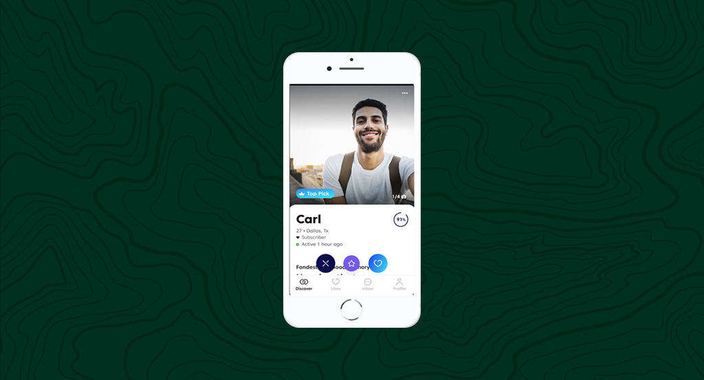
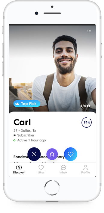
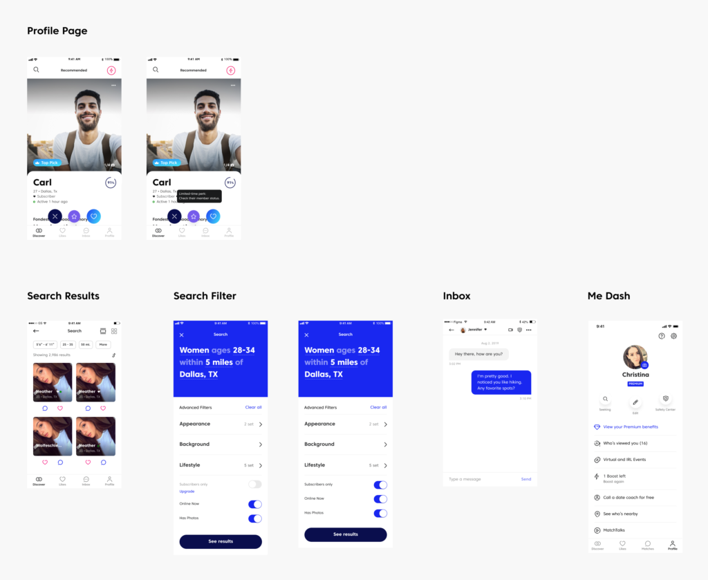
Our top request was for members to be able to tell who is a subscriber. On the app, only members can respond to other members. We were getting feedback that people could not tell who can message them back. 

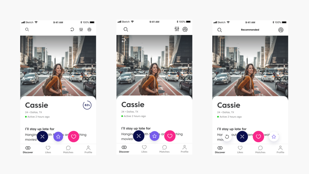
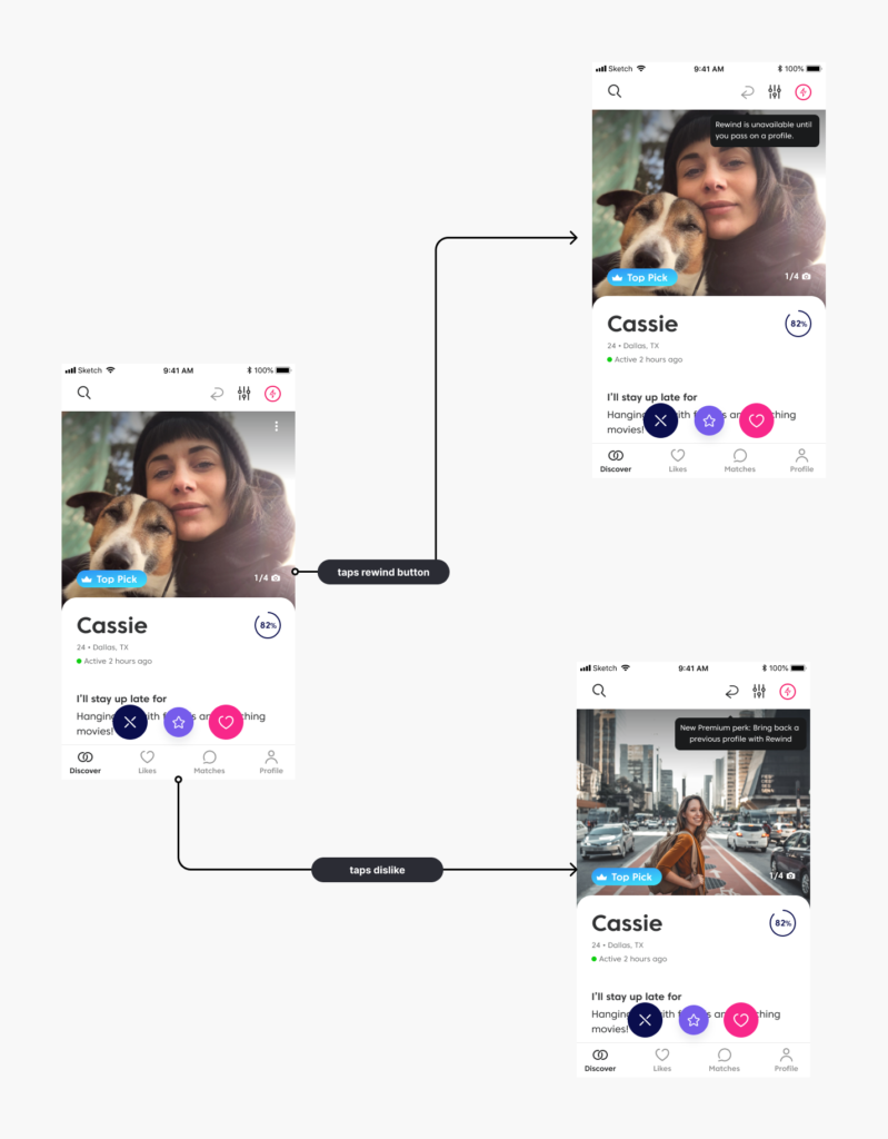
Another request was about users accidently swiping X on someone. They wanted to be able to go back. 

These designs were made before Match rebranded.

Research/
Discovery

I started by taking a step back and prioritizing feedback by quantity of requests and how possible they are to implement. 

I looked at who our Premium members are. They are 17% of our monthly active users, mostly male, older than 40. Half are divorced. I keep this in mind when finding segments to user test.

Subscriber
Badge (part 1)

After brainstorming several ideas, we landed on some sort of visual element that indicates whether or not a user is a subscriber.

Iteration

Since we have a pretty established profile page, I dug into different options to show status. I had to of done dozens of options. I showed them to my Product manager and we narrowed down our favorites. 

I did a user test asking users within our segment to interact with the page. I wanted to see if they understood what the badge meant. 

Solution 1

We ended up going a subtle route because we already had many elements trying to get your attention on the profile page. We decided that the member status is about as important as activity. Also this design tested well because subscriber is written clearly next to the icon.

we added several touch points including the search results and conversation view.

There was a small shift of likes and messages sent by premium members to other subscribers. 

Rewind
(part 2)

Part two of our solution to increase Premium user satisfaction is to implement a rewind feature. This feature allows you to go back if you accidently passed on another person.

Iteration

Just like with premium badge, I used our already established profile page as a building block. I experimented with several positions and rewind icons. 

After several different options, we chose 4 or 5 options we liked the most. I user tested with people who are within my customer segment, and asked them to dislike someone then reverse that decision. 

Once we were happy with the user tests we looked at ways to introduce the feature. We went with a tool tip because it is less invasive that a modal. 

User flows

Solution 2

We implemented a solution that integrated into our current profile page. We got user feedback to find a solution that was clear. 3% of our daily active users use rewind. About 17k users use rewind daily. 

©Keila White 2026