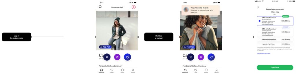
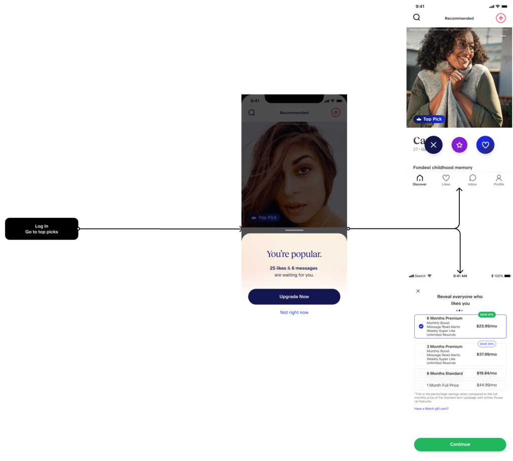
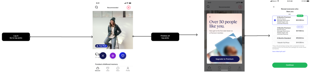
This reframed the problem from “how do we convert free users” to “how do we surface value at the exact moment of intent without breaking trust.”
We focused on free members as the highest leverage segment for improving subscription conversion. An audit showed they represented a large share of active users, but lacked clear pathways into paid value.
Data analysis revealed a core segment of men aged 40–50, many re-engaging with the app post-divorce. Across this group, intent was high, but conversion was constrained.
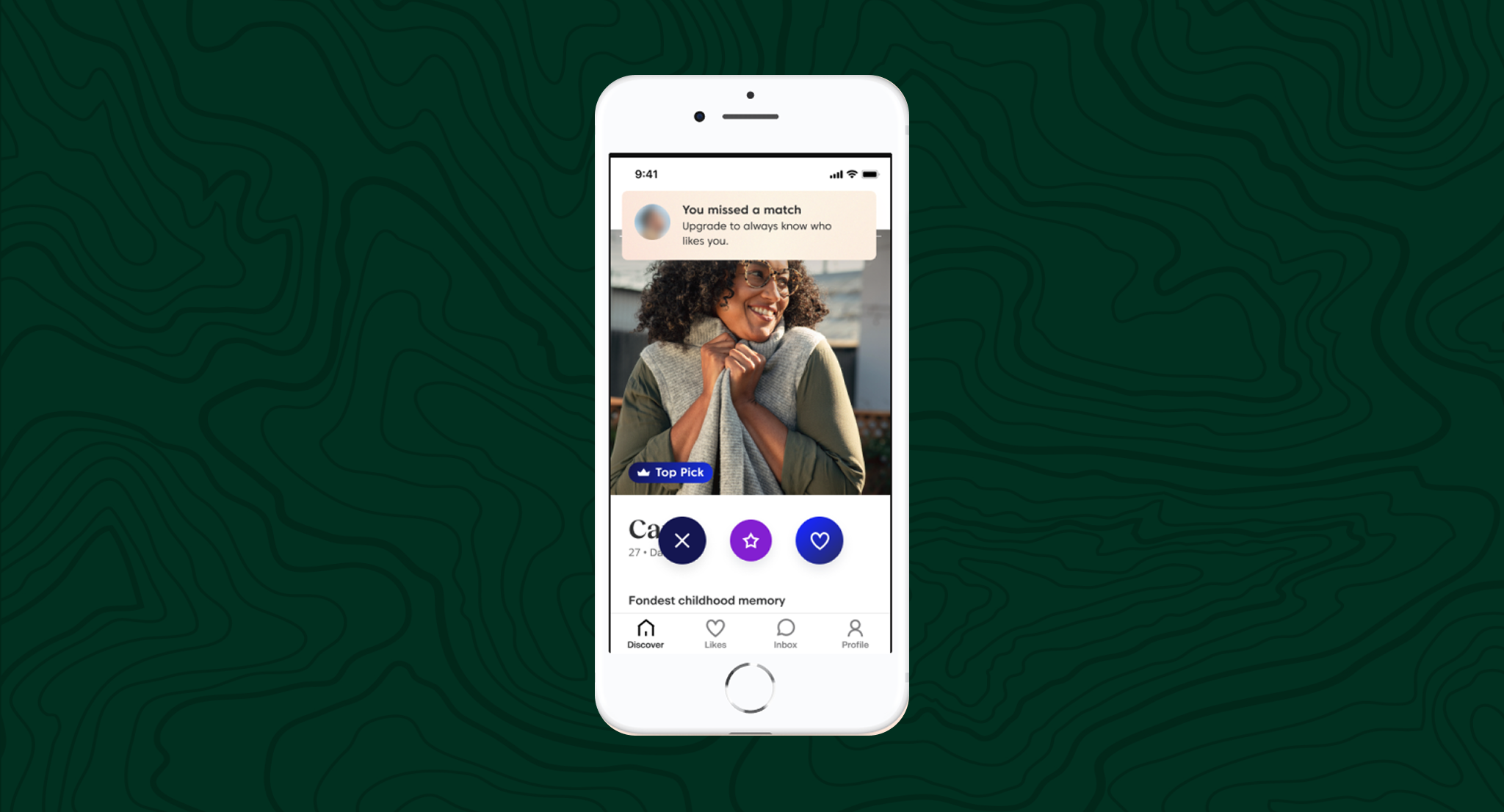
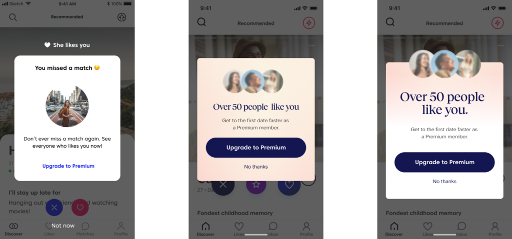
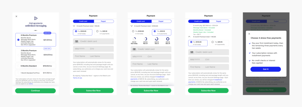
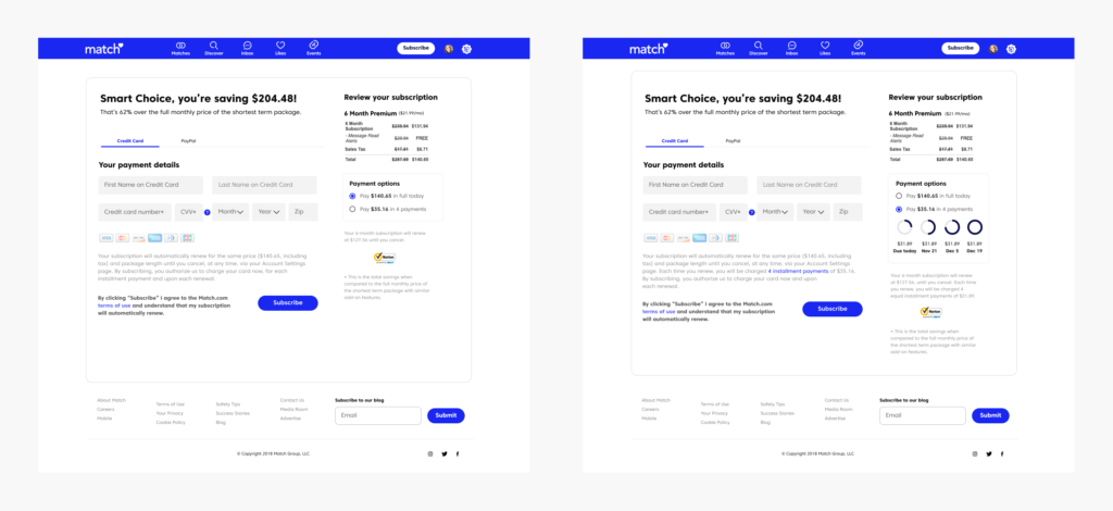
Survey data reinforced this tension. Users primarily subscribed to access core intent signals like likes and matches, but consistently cited price as the main barrier.
This reframed the opportunity from driving upgrades to aligning monetization with moments of intent, where perceived value was highest.